Design System
미니멀하고 세련된 디자인 시스템입니다. Light/Dark 모드를 모두 지원합니다.
Colors
Primary (Purple)
Accent (Blue)
Secondary (Navy)
Status Colors
Brand Soft (배너/하이라이트 배경 — light/dark 자동 분기)
Status Soft (배너/하이라이트 배경 — light/dark 자동 분기)
Semantic Background (bg-bg-*) — 신규 코드는 이쪽을 사용
bg-bg-primary메인 페이지 배경
bg-bg-secondary카드/섹션 보조 배경
bg-bg-tertiary3차 배경 (구분/회색)
bg-bg-elevated카드/모달 elevated
bg-bg-hoverhover 상태
bg-bg-activeactive 상태
bg-bg-selected선택 상태
Semantic Text (text-content-*) — 신규 코드는 이쪽을 사용
Aa 본문 텍스트 샘플
text-content-primary본문 기본 텍스트
Aa 본문 텍스트 샘플
text-content-secondary보조 텍스트
Aa 본문 텍스트 샘플
text-content-tertiary3차 텍스트
Aa 본문 텍스트 샘플
text-content-mutedplaceholder, disabled
Aa 본문 텍스트 샘플
text-content-inverse어두운 배경 위 흰색
Semantic Border (border-stroke-*)
border-stroke-default기본 경계선
border-stroke-hoverhover 경계선
border-stroke-focusfocus 경계선
Typography
AIGEO Score
AI 시대의 검색 최적화
핵심 서비스
섹션 제목
카드 제목 및 강조 텍스트
본문 텍스트입니다. Team HAI는 SEO를 넘어 AEO와 GEO까지 아우르는 AI 시대 종합 검색 최적화 플랫폼입니다.
보조 텍스트 및 캡션에 사용됩니다.
라벨, 태그, 메타 정보에 사용됩니다.
Font Families
font-sans (기본)Team HAI — 팀 하이 ABC 123 abc
font-inter (deprecated alias)Team HAI — 팀 하이 ABC 123 abc
font-pretendard (alias)Team HAI — 팀 하이 ABC 123 abc
font-monoTeam HAI — 팀 하이 ABC 123 abc
Font Sizes
| Name | Size | Line Height | Preview | |
|---|---|---|---|---|
text-micro | 0.6875rem (11px) | 1.4 | Aa 가나다 | |
text-mini | 0.75rem (12px) | 1.4 | Aa 가나다 | |
text-small | 0.8125rem (13px) | 1.5 | Aa 가나다 | |
text-regular | 0.9375rem (15px) | 1.6 | Aa 가나다 | |
text-large | 1.0625rem (17px) | 1.6 | Aa 가나다 | |
text-title-1 | 1.0625rem (17px) | 1.4 / 600 | Aa 가나다 | |
text-title-2 | 1.3125rem (21px) | 1.33 / 600 | Aa 가나다 | |
text-title-3 | 1.5rem (24px) | 1.33 / 600 | Aa 가나다 | |
text-title-4 | 2rem (32px) | 1.33 / 600 | Aa 가나다 | |
text-title-5 | 2.5rem (40px) | 1.1 / 600 | Aa 가나다 | |
text-title-6 | 3rem (48px) | 1.1 / 600 | Aa 가나다 | |
text-title-7 | 3.5rem (56px) | 1.1 / 600 | Aa 가나다 | |
text-title-9 | 4.5rem (72px) | 1.1 / 600 | Aa 가나다 |
Font Weights
font-lightAa 가
Light (300)
font-normalAa 가
Normal (400)
font-mediumAa 가
Medium (500)
font-semiboldAa 가
Semibold (600)
font-boldAa 가
Bold (700)
Border Radius
Custom (Team HAI)
4px6px8px12px16px24px32pxTailwind Default
0px2px4px6px8px12px16px24px9999pxShadows & Glow
shadow-smshadow-mdshadow-lgshadow-glow-indigoshadow-glow-blueshadow-glow-greenGradients
bg-brand-gradientBrand Gradient (Navy → Purple → Blue)
linear-gradient(166.06deg, #2a3660 8.92%, #6877e5 50.66%, #54bcf6 92.40%)bg-linear-gradientLinear (Indigo → Blue)
linear-gradient(135deg, #5e6ad2 0%, #4ea7fc 100%)bg-hero-gradientHero Gradient (Dark)
linear-gradient(180deg, #08090a 0%, #111214 50%, #08090a 100%)Animations & Transitions
Transition Durations
duration-quick100ms
duration-regular250ms
Animation Classes
animate-fade-inFade In · 0.25s ease-out
animate-fade-in-upFade In Up · 0.25s ease-out
animate-slide-upSlide Up · 0.25s ease-out
animate-slide-downSlide Down · 0.25s ease-out
animate-scale-inScale In · 0.15s ease-out
animate-slide-in-leftSlide In Left · 0.2s ease-out
CSS Variables — Light / Dark Mode
시맨틱 컬러 토큰은 Light/Dark 모드에 따라 자동으로 전환됩니다. JSX에서는 var(--color-*), Tailwind 에서는 bg-(--color-*) 형태로 사용합니다.
Background
| Token | Light | Dark | Preview | |
|---|---|---|---|---|
--color-bg | #ffffff | #2a3660 | ||
--color-bg-secondary | #fafafa | #060d15 | ||
--color-bg-tertiary | #efefef | #08111c | ||
--color-bg-elevated | #ffffff | #08111c | ||
--color-bg-hover | #efefef | #0a1623 | ||
--color-bg-active | #d9d9d9 | #0c1a2a | ||
--color-bg-selected | #dbdde0 | #0c1a2a | ||
--color-bg-selected-hover | #b4b9bf | #0d1d2f |
Text
| Token | Light | Dark | Preview | |
|---|---|---|---|---|
--color-text | #222222 | #fafafa | ||
--color-text-secondary | #666666 | #b1aea9 | ||
--color-text-tertiary | #999999 | #8e8b87 | ||
--color-text-muted | #999999 | #6a6865 | ||
--color-text-white | #ffffff | #ffffff |
Border
| Token | Light | Dark | Preview | |
|---|---|---|---|---|
--color-border | #d9d9d9 | rgba(255,255,255,0.1) | ||
--color-border-hover | #bcbcbc | rgba(255,255,255,0.2) | ||
--color-border-focus | rgba(13,29,47,0.5) | rgba(104,119,229,0.5) |
Primary / Secondary / Accent (Brand)
| Token | Light | Dark | Preview | |
|---|---|---|---|---|
--color-primary | #6877e5 | #6877e5 | ||
--color-primary-hover | #5e6bce | #8990f0 | ||
--color-primary-action | #6877e5 | #6877e5 | ||
--color-primary-action-hover | #4e59ac | #4e59ac | ||
--color-primary-light | #f0f1fc | rgba(104,119,229,0.15) | ||
--color-primary-soft | rgba(104,119,229,0.10) | rgba(132,144,235,0.18) | ||
--color-secondary | #34508c | #4f70b3 | ||
--color-secondary-hover | #2c447a | #5f7fc0 | ||
--color-secondary-light | #eef2f9 | rgba(52,80,140,0.25) | ||
--color-secondary-soft | rgba(52,80,140,0.08) | rgba(52,80,140,0.20) | ||
--color-accent | #54bcf6 | #54bcf6 | ||
--color-accent-hover | #38bdf8 | #7dd3fc | ||
--color-accent-soft | rgba(84,188,246,0.15) | rgba(84,188,246,0.20) |
Brand Palette (50–950)
| Token | Light | Dark | Preview | |
|---|---|---|---|---|
--color-primary-50 | #f0f1fc | rgba(104,119,229,0.12) | ||
--color-primary-100 | #e8ebfb | rgba(104,119,229,0.18) | ||
--color-primary-200 | #d0d5f7 | #d0d5f7 | ||
--color-primary-300 | #a8b0f0 | #a8b0f0 | ||
--color-primary-400 | #8490eb | #8490eb | ||
--color-primary-500 | #6877e5 | #6877e5 | ||
--color-primary-600 | #5e6bce | #5e6bce | ||
--color-primary-700 | #535fb7 | #535fb7 | ||
--color-primary-800 | #4e59ac | #4e59ac | ||
--color-primary-900 | #3e4789 | #3e4789 | ||
--color-primary-950 | #242a50 | #242a50 | ||
--color-secondary-50 | #eef2f9 | rgba(52,80,140,0.18) | ||
--color-secondary-100 | #dde4f1 | rgba(52,80,140,0.28) | ||
--color-secondary-500 | #34508c | #34508c | ||
--color-secondary-950 | #121b2d | #121b2d | ||
--color-accent-50 | #f0f9ff | rgba(84,188,246,0.10) | ||
--color-accent-100 | #e0f2fe | rgba(84,188,246,0.16) | ||
--color-accent-500 | #0ea5e9 | #0ea5e9 | ||
--color-accent-950 | #082f49 | #082f49 |
Team HAI Brand Aliases
| Token | Light | Dark | Preview | |
|---|---|---|---|---|
--color-navy | #2a3660 | #2a3660 | ||
--color-navy-hover | #263156 | #263156 | ||
--color-navy-dark | #202948 | #202948 | ||
--color-purple | #6877e5 | #6877e5 | ||
--color-purple-hover | #5e6bce | #5e6bce | ||
--color-blue-brand | #54bcf6 | #54bcf6 |
Status Colors
| Token | Light | Dark | Preview | |
|---|---|---|---|---|
--color-success | #22c55e | #22c55e | ||
--color-error | #ef4444 | #ef4444 | ||
--color-warning | #f97316 | #f97316 | ||
--color-info | #3b82f6 | #3b82f6 | ||
--color-success-soft | rgba(34,197,94,0.14) | rgba(34,197,94,0.22) | ||
--color-error-soft | rgba(239,68,68,0.14) | rgba(239,68,68,0.22) | ||
--color-warning-soft | rgba(249,115,22,0.14) | rgba(249,115,22,0.22) | ||
--color-info-soft | rgba(59,130,246,0.14) | rgba(59,130,246,0.22) | ||
--color-green (alias) | #22c55e | #22c55e | ||
--color-red (alias) | #ef4444 | #ef4444 | ||
--color-orange (alias) | #f97316 | #f97316 | ||
--color-yellow (alias) | #eab308 | #eab308 | ||
--color-indigo (alias) | #6366f1 | #6366f1 | ||
--color-blue (alias) | #3b82f6 | #3b82f6 |
Shadows
| Token | Light | Dark | Preview | |
|---|---|---|---|---|
--shadow-sm | 0 1px 2px rgba(0,0,0,0.05) | 0 1px 2px rgba(0,0,0,0.3) | ||
--shadow-md | 0 4px 6px -1px rgba(0,0,0,0.1) | 0 4px 6px -1px rgba(0,0,0,0.4) | ||
--shadow-lg | 0 10px 15px -3px rgba(0,0,0,0.1) | 0 10px 15px -3px rgba(0,0,0,0.5) |
Layout & Motion
| Token | Light | Dark | Preview | |
|---|---|---|---|---|
--header-height | 64px | 64px | ||
--page-padding-inline | 24px | 24px | ||
--page-max-width | 1024px | 1024px | ||
--speed-quick | 0.1s | 0.1s | ||
--speed-regular | 0.25s | 0.25s |
Buttons
Variants
Sizes
With Icons
States
IconButton
aria-label이 필수이고 type="button"이 기본값이라 form 내부에서도 안전하다. 스타일은 variant(ghost/outline/filled) × tone(default/primary/destructive/success/warning) 로 직교 분리한다.Sizes (variant=ghost, tone=default)
Variant × Tone matrix
States
실제 사용 예시 (인라인 액션)
Code
import { IconButton } from "@inus/ui";
import { Pencil, Trash2 } from "lucide-react";

// 기본 (ghost / default / md)
<IconButton icon={Pencil} aria-label="편집" />

// 파괴적 액션
<IconButton
  icon={Trash2}
  aria-label="삭제"
  tone="destructive"
  tooltip="이 항목을 삭제합니다"
/>

// 강조된 primary 액션
<IconButton
  icon={Check}
  aria-label="승인"
  variant="filled"
  tone="primary"
  size="lg"
/>
Chip
Badge(정적 정보 표시)와 분리된 역할.onClick이 있으면 cursor-pointer + role="button", onRemove가 있으면 우측 X 버튼, active로 선택 상태 표현. 사이즈는 Button과 동일한 7단계.Variants (size=md, active=false)
Variants (active=true) — 선택 상태
Sizes (variant=primary)
With icon
Removable (X 버튼) — onRemove
Interactive — onClick (토글)
ChipGroup — single (라디오 그룹)
선택값: all
ChipGroup — multiple (다중 선택)
선택값: react, tailwind
Disabled
Code
import { Chip, ChipGroup } from "@inus/ui";
import { Filter, Tag } from "lucide-react";

// 정적 표시 (인터랙티브 X)
<Chip variant="primary">관리자</Chip>

// 토글 칩
<Chip
  variant="outline"
  active={isSelected}
  onClick={() => setIsSelected(!isSelected)}
  icon={Filter}
>
  필터
</Chip>

// 제거 가능 태그
<Chip variant="primary" onRemove={() => removeTag(tag)}>
  {tag}
</Chip>

// 라디오 그룹
<ChipGroup
  options={[
    { value: "all", label: "전체" },
    { value: "draft", label: "임시", icon: Pencil },
  ]}
  value={value}
  onChange={setValue}
/>

// 다중 선택
<ChipGroup
  multiple
  options={tagOptions}
  value={selectedTags}
  onChange={setSelectedTags}
  variant="primary"
/>
Inputs
Variants
Sizes
With Icons
Error State
This field is required
Select
Please select an option
Checkbox & Toggle
Checkbox
Toggle
File Upload (FileDropzone)
버튼 클릭 · 드래그&드롭 · 클립보드 붙여넣기 통일 컴포넌트
- • PDF · TXT · MD
- • 클릭 · 드래그&드롭 · 붙여넣기(Ctrl+V)
- • 파일당 최대 5.00 MB
variant="box" · multiple · maxSizeMB · AttachmentList
이미지 업로드 + 브랜드 파일 불러오기
variant="button" · 업로드 또는 브랜드 파일(포털) 선택 · 커스텀 프리뷰는 형제로 배치
Cards
Default Card
Basic card with header
카드 컨텐츠 영역입니다. 다양한 정보를 표시할 수 있습니다.
Elevated Card
Card with shadow
그림자가 있는 카드입니다.
Highlight Card
NewEmphasized card style
강조가 필요한 콘텐츠에 사용됩니다.
Top Accent Card
Card with colored top border accent
상단에 컬러 액센트 보더가 있는 카드입니다. borderTopColor를 style로 지정하여 원하는 색상을 사용합니다.
Interactive Card
Clickable card with hover effect
호버 시 테두리 색상이 변경되는 인터랙티브 카드입니다.
87
AIGEO Score
Image Cards
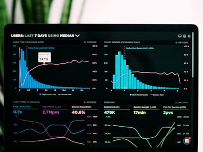
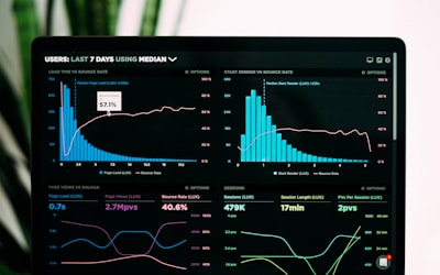
AI Analytics Dashboard
실시간 AI 검색 트렌드 분석과 인사이트를 확인하세요.

SEO Performance
월간 SEO 성과 리포트와 개선 추천사항입니다.

GEO Strategy Guide
AI 시대 검색 최적화 전략 가이드북
Horizontal Layout (Left Image)

Enterprise Plan
대규모 팀을 위한 맞춤형 AI 검색 최적화 솔루션입니다. 전담 매니저와 함께 브랜드 성장을 가속화하세요.
Background Image with Overlay
Next-Gen AI Platform
더 강력해진 AI 분석 엔진으로 검색 최적화의 새로운 기준을 제시합니다.
Video Card Style

AIGEO 시작하기
Carousel
Basic Carousel
Multi-Slide Carousel
Image Card Carousel
Analytics
실시간 분석 대시보드

Reports
상세 리포트 생성

Insights
AI 인사이트 도출

Team
협업 기능
Autoplay Carousel
Hashtag
Variants
Sizes
Interactive & Removable
Hashtag Input
현재 태그: SEO, AEO, GEO
Hashtag Group (Selectable)
선택됨: SEO
MultiSelect
Basic MultiSelect
선택됨: 0개
Grouped MultiSelect
Limited Selection (Max 3)
With Error State
최소 1개 이상 선택해주세요
Sizes
Badges
Variants
Sizes
With Dot
Dismissible (deprecated)
⚠ Badge.onDismiss는 deprecated.
제거 가능한 칩이 필요하면 <Chip onRemove={...}> 사용 — Badge는 정적 정보 표시 전용으로 유지.
Avatar
Sizes
With Image & Fallback
 CNJD
CNJDAvatar Group
Tabs
Default Tabs
Overview content goes here.
Line Tabs
Details content.
Line Tabs (Emphasis)
선택 시 라인 · 글자색 · 두께가 함께 강조되고 배경이 살짝 바뀝니다.
Pills Tabs
All items.
Skeleton
Basic
Avatar Skeleton
Text Skeleton
Card Skeleton
Gradients & Effects
Text Gradient
AI가 추천하지 않으면, 브랜드는 존재하지 않는다.
Glow Effects
Primary Glow
Glass Effect
Glass Morphism
Backdrop blur effect
Navbar
Default Navbar
Solid Navbar
Blur (Glass) Navbar
Scroll to see glass effect
Footer
Default Footer
Footer with Newsletter
Minimal Footer
Centered Footer
Hero
Default Hero (Fade In)
AI 시대의 검색 최적화
Slide Up Hero
AI가 추천하지 않으면,
브랜드는 존재하지 않는다
Stagger Animation Hero
AIGEO Score로 시작하는
검색 최적화 여정
Gradient Animation Hero
The Future of Search Optimization
Particles Hero
Real-time AI Search Analytics
Split Layout Hero (with Image)
Complete Search Optimization Suite
AIGEO Score
Floating Components
Floating Action Button (FAB)
Variants
Sizes
With Badge
Extended FAB
With Pulse Animation
FAB Group
Scroll Progress
스크롤 진행률을 표시하는 프로그레스 바입니다. 이 페이지 상단에서 실제 동작을 확인할 수 있습니다.
ScrollProgress 컴포넌트는 페이지 상단/하단에 고정되어 현재 스크롤 위치를 표시합니다.
Back to Top
페이지를 아래로 스크롤하면 우측 하단에 "위로 가기" 버튼이 나타납니다.
Fixed Position Demo
FloatingButton은 다양한 position으로 화면에 고정할 수 있습니다:
position="relative"로 설정하면 flow 레이아웃에서 사용 가능합니다.
Modal
Basic Modal
Sizes
Overlay Darkness
Usage Code
import { Modal, ModalContent, ModalHeader, ModalTitle,
         ModalDescription, ModalBody, ModalFooter } from "@/components/ui";

<Modal open={isOpen} onOpenChange={setIsOpen}>
  <ModalContent size="lg" rounded="md">
    <ModalHeader>
      <ModalTitle>제목</ModalTitle>
      <ModalDescription>설명</ModalDescription>
    </ModalHeader>
    <ModalBody>내용</ModalBody>
    <ModalFooter>
      <Button>확인</Button>
    </ModalFooter>
  </ModalContent>
</Modal>
Stat
Basic Stats
Stats with Icons
Stats with Trends
Stat Variants
Value Colors
ProgressBar
Basic Progress
Sizes
Colors
Auto Color (threshold-based)
With Labels
SentimentBadge
Sentiment Variants
With Score Display
Custom Thresholds
ScoreDisplay
Basic Score
Sizes
With Change Indicator
Without Max / Custom Suffix
Manual Color
Full Width Layout Demo
Navbar, Hero, Footer는 전체 너비 레이아웃에서 사용됩니다. 아래 버튼을 클릭하면 실제 전체 너비 데모를 볼 수 있습니다.
실제 랜딩 페이지에서는 container를 사용하지 않고 전체 너비로 렌더링됩니다. Hero, Navbar, Footer 컴포넌트는 내부적으로 container를 관리합니다.